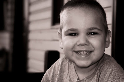
“The object of a question is to obtain information that matters to us, and no one else.”
- Sean Connery as William Forrester in "Finding Forrester"

Visit My Amazon Store

Showing posts with label P and P Workflow. Show all posts

Thursday, July 19, 2007

P&P Workflow: #10


Over the next couple of weeks we will be working with a local community theater's production of The Wizard of Oz. In the course of the show, there is a scene where the Wicked Witch of the West writes the words "Surrender Dorothy" across the sky. Being in a theater, they are unable to recreate that for obvious logistical reasons. However, through the magic of video projection, we created an animation to simulate the skywriting - albeit a simple soft-edged wipe across each line.

This may be a pretty basic tutorial, and one that I don't use too often, but I thought it might be helpful.

Step One: Create a new document of your desired size. (Here I used the standard NTSC DV size (720x540 with square pixels) because we are projecting it.) and type in your text. (I used Arial Narrow.)

Step Two: Next, right-click (Mac: Ctrl+Click) on your text layer and select "Create Work Path." Hide your text layer and create a blank layer above it. Your resulting view should look like this:
Step Three: Next, set your brush to a cloud shape (if you are going for this similar effect) and make sure your settings in the Brushes panel are appropriate to your desired effect.

Step Four: In the Paths panel, with the blank layer still selected and the work path highlighted, click on the button at the bottom called "Stroke Path With Brush"
And here is your final image (I added a Curves adjustment to ad more contrast):
*If you would like to contribute to the P&P Workflow, please email Jason.

Wednesday, June 27, 2007

P&P Workflow: #9

Lightroom 1.1 Edition
by Jason D. Moore

Before:
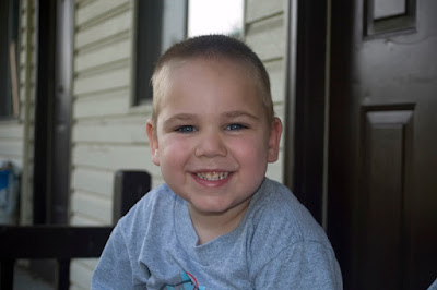
Taken of my fiancee, Kim, at her parents' house in Bainbridge, NY on 6/23/2007 at 3:24:59PM (EST). Taken with available light, no flash. By the way, I used my future mother-in-law's cream-colored shirt as a reflector to cast the side light on Kim and Buddy. It just happened that way as she was sitting in the sun off camera which offered a nice soft light.
  • Nikon D200
    Program Mode
    56.0-200.0 mm f/4.0-5.6 lens
    1/100 at f/5.0
    ISO 400
    Focal Length 62mm
    RAW

In Adobe Photoshop Lightroom 1.1 (Develop Module):
  • Basic:
    White Balance: (Set to Auto in the camera and adjusted to:)
    -Temp: 4941
    -Tint: -13
    -Exposure: -0.24
    -Recovery: 0
    -Fill Light: 11
    -Blacks: 19
    -Clarity: 27

  • Saturation:
    Purple, Magenta: -100

  • Detail - Sharpening:
    -Amount: 120
    -Radius: 1.0
    -Detail: 76
    -Masking: 0


  • Lens Vignetting:
    -Amount: -100
    -Midpoint: 22
After:

Now, I'm not totally up to speed on all the new features and improvements in LR 1.1 but after just playing around with it, I must say that, at the very least, the sharpening is way beyond what it once was. Clarity adds some midtone contrast and it really added some depth.

There was one small thing I noticed so far that I'm not sure I like. When you are cropping, you do have the ability to constrain the aspect ratio or not. However, in this version, the icon isn't as obvious as to whether or not the aspect ratio is locked. The yoke on the lock is either up or down which isn't as quickly identifiable as locked or not as the older icon.

But all-in-all I like what I've seen so far.

*If you would like to contribute to the P&P Workflow, please email Jason.

Wednesday, April 25, 2007

P&P Workflow: #8

by Jason D. Moore

Before:
Taken one year ago tomorrow in Redwood National Park, CA 4/26/2006, 2:46PM (PST). Taken with available light, no flash.
  • Nikon D50
    Auto Exposure Mode
    18.0-50.00 f/3.5-5.6 lens
    1/25 at f/3.5
    ISO 800
    Focal Length 18mm
    RAW

In Adobe Photoshop Lightroom 1.0 (Develop Module):
  • Basic:
    White Balance:
    -Temp: 4750
    -Tint: -8
    -Exposure: -0.52
    -Recovery: 100
    -Fill Light: 0
    -Blacks: 34
  • Tone Curve:
    -Highlights: 0
    -Lights: +30
    -Darks: -18
    -Shadows: 0
  • Saturation:
    -Red: +100
    -Orange: +75
    -Yellow: +4
    -Green: -41
    -Aqua: -13
    -Blue, Purple, Magenta: -100
  • Detail:
    -Sharpening: 25
    -Color Noise Reduction: 25
  • Lens Vignetting:
    -Amount: -60
    Midpoint: 42
After:

*If you would like to contribute to the P&P Workflow, please email Jason.

Wednesday, February 28, 2007

P&P Workflow: #7

by Jason D. Moore

Before:
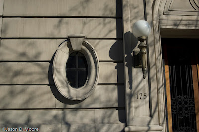
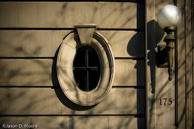
Taken on 72nd Street, NYC 1/30/2007, 11:18 AM. Taken with available light, no flash.
  • Nikon D50
    Auto Exposure Mode
    18.0-50.00 f/3.5-5.6 lens
    1/1600 at f/4.0
    ISO 200
    Focal Length 25mm
    RAW

In Adobe Photoshop Lightroom 1.0 (Develop Module):

  • Basic:
    White Balance: As Shot
    Temp: 4800
    Tint: -13
    Exposure: +0.76
    Recovery: 100
    Fill Light: 28
    Blacks: 19
  • Tone Curve:
    Highlights: 0
    Lights: +10
    Darks: -9
    Shadows: -45
  • Split Toning:
    Highlights: Hue – 47, Saturation – 35
  • Detail:
    Sharpening: 100

In Photoshop CS3 Beta:

  • Duplicate background layer (on general principles to preserve the original)
  • Convert for Smart Filters.
  • Apply a little grain by applying a Lens Blur with a Noise amount of 3 with a monochromatic, uniform distribution. (I just like the way lens blur applies the noise.)
  • Apply a Lens Correction Filter with the following settings:
    -Vignette – Amount: -79, Midpoint: +43
    -Transform:
    Vertical: -17
    Horizontal: +5
    Angle: 359.99
    Scale: 108
  • Add a Curves Adjustment Layer to push the lamp closer to white. Fill the mask with black and, with a soft-edged brush, paint with white over the lamp.
  • There were some spots on the window, so I created a new layer and cloned and healed those spots, making sure the “Sample All Layers” box is checked.
After:
*If you would like to contribute to the P&P Workflow, please email Jason.

Tuesday, February 27, 2007

P&P Workflow: #6

by Jason D. Moore

Before:

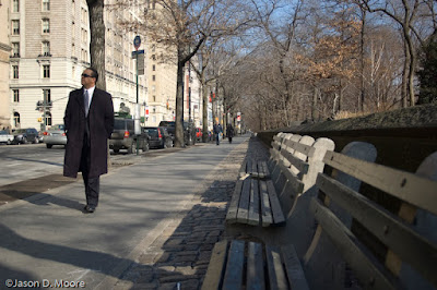
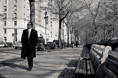
Taken near the corner of 72nd Street & Central Park West, NYC 1/30/2007, 11:08 AM. Taken with available light, no flash.
  • Nikon D50
    Auto Exposure Mode
    18.0-50.00 f/3.5-5.6 lens
    1/640 at f/4.2
    ISO 200
    Focal Length 26mm
    RAW

In Adobe Photoshop Lightroom 1.0:

  • Cropped to constrain proportions and make sure the right side of the subject was roughly along the left-hand third.
  • In Develop Module:
    -Basic:
    White Balance: As Shot
    Temp: 5150
    Tint: -12
    Exposure: +0.61
    Recovery: 100
    Fill Light: 0
    Blacks: 28
    -Tone Curve:
    Highlights: +8
    Lights: +11
    Darks: +4
    Shadows: -18
    -Split Toning:
    Highlights: Hue-42, Saturation-12
    Shadows: Hue-229, Saturation-8

In Photoshop CS3 Beta:

  • Lab Sharpening:
    -Duplicate the background layer
    -Convert for Smart Filters
    -Convert to Lab Color
    -Select the Lightness channel
    -Apply an unsharp mask with the settings (Amount: 149%, Radius: 1.1px, Threshold: 0 levels)
    -Convert back to RGB. (Don’t rasterize or flatten when prompted.
  • Apply a radial gradient (white to black) from the center of the main subject outward to increase his sharpness while leaving the rest of the image, as is.
After:
*If you would like to contribute to the P&P Workflow, please email Jason.

Monday, February 12, 2007

Running a Little Behind

With the show over the weekend and working quite late Saturday night and recovering today, I didn't have a chance to work on the P&P Weekly yet for this week but I'll try to have it up by sometime on Tuesday. In the meantime, enjoy the next installment in the Workflow series, below.

Sorry for the delay.

P&P Workflow: #5

by Jason D. Moore

Before:
Taken on the corner of 72nd Street & Central Park West, NYC 1/30/2007, 11:08 AM
Taken with available light, no flash.
  • Nikon D50
    Auto Exposure Mode
    18.0-50.00 f/3.5-5.6 lens
    1/1000 at f/5.3
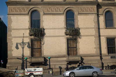
    ISO 200
    Focal Length 40mm
    RAW

In Adobe Camera Raw 4.0:

  • Basic:
    White Balance: As Shot
    Temp: 5100
    Tint: -11
    Exposure: +0.87
    Recovery: 100
    Fill Light: 0
    Blacks: 20
    Brightness: +50
    Contrast: +25
  • HSL/Grayscale:
    Convert to Grayscale
    Reds: +14
    Oranges: -2
    Yellows: -11
    Greens: -19
    Aquas: -16
    Blues: +13
    Purples: +24
    Magentas: +21
  • Detail:Sharpening: 25

In Photoshop CS3 Beta:

  • Duplicate the background layer.
  • Convert the duplicate layer for Smart Filters.
  • Apply a Lens Correction filter:
    Vertical Perspective: -8
    Horizontal Perspective: +11
    Angle: 358.76
    Scale: 108
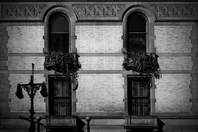
  • Apply a Curves Adjustment Layer to the bricks with points at Input/Output 167/125 and 205/219. This brings out the various shades in the brick to add character.
  • Apply a Curves Adjustment Layer to the stone work with points at Input/Output 37/0 to add contrast to the stone.
  • Stamp visible and apply a Vignette with an amount of -75.
  • Apply a Curves Adjustment Layer to the whole image with points at Input/Output 27/21 and 189/195 to increase the overall contrast.
After:
*If you would like to contribute to the P&P Workflow, please email Jason.

Friday, February 09, 2007

P&P Workflow: #4

by Jason D. Moore
Before:
Taken on 72nd Street, NYC 1/30/2007, 11:15 AM
Taken with available light, no flash.
  • Nikon D50
    Auto Exposure Mode
    18.0-50.00 f/3.5-5.6 lens
    1/250 at f/4.0
    ISO 200
    Focal Length 24mm
    RAW

In LightroomDevelop Module:

  • Cropped so the two lights were in line with the diagonal and just outside of the intersections of the thirds and rotated 2.20 degrees.
  • Basic:
    White Balance: As Shot
    Temp: 4800
    Tint: -14
    Exposure: +0.54
    Recovery: 100
    Fill Light: 26
    Blacks: 15
    Brightness: +50
    Contrast: +25
  • Tone Curve:
    Sliders below the curve at: 10, 60, and 77
    Highlights: 0
    Lights: +22
    Darks: -68
    Shadows: 0
  • Color Adjustments:
    Saturation:
    Reds: +54
    Yellows: +13
    Greens: +100
    Cyans: +54
    Blues: +47
    Magentas: -40
  • Split Toning - Highlights:
    Hue: 36
    Saturation: 45
  • Detail:
    Sharpen: 100
    Smooth: 0
    De-Noise: 25
After:
*If you would like to contribute to the P&P Workflow, please email Jason.

Wednesday, February 07, 2007

P&P Workflow: #3

by Jason D. Moore

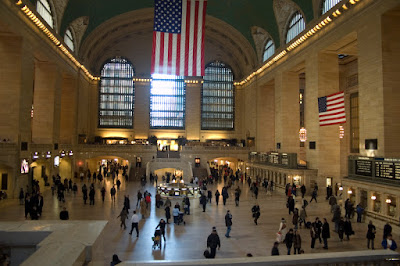
Before: Taken in Grand Central Station, NYC 1/30/2007, 1:40 PM
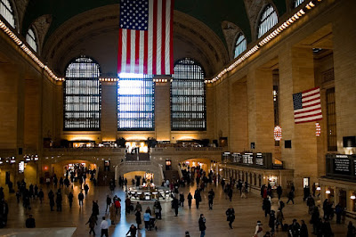
Taken with available light, no flash.
  • Nikon D50
    Auto Exposure Mode
    18.0-50.00 f/3.5-5.6 lens
    1/20 at f/3.5
    ISO 800
    Focal Length 18mm
    RAW

In LightroomDevelop Module:

  • Cropped and rotated so the line of lights at the far end of the room were level and along a third and the left edge of the large flag was along a third.
  • Basic:
    Recovery: 32
    Blacks: 16
  • Tone Curve:
    Highlights: 0
    Lights: +19
    Darks: -27
    Shadows: 0
  • Color Adjustments:
    Hue:
    -Yellows: -7
    Saturation:
    -Reds: +100
    -Yellows: -40
    -Greens: 0
    -Cyans: +54
    -Blues: +13
    -Magentas: 0
  • Detail:
    Sharpen, Smooth, De-noise = 100
  • Lens Corrections:
    Vignetting Amount = -69

In Photoshop CS3 beta:

  • Lab Sharpening
    -Duplicate background layer
    -Convert to Lab Color mode (Don’t flatten)
    -Select the “Lightness” channel
    -Apply an Unsharp Mask filter with the settings: Amount: 81%, Radius: 1.0px, Threshold: 0 levels
    -Convert back to RGB (Don’t flatten)
  • Lower the opacity of this layer to 75% (to your taste) to help the sharpening blend more smoothly.
After:
*If you would like to contribute to the P&P Workflow, please email Jason.

Friday, February 02, 2007

P&P Workflow: #2

by Andy Smith - "Film Noir"

Before:

Olympus Evolt 500
Handheld
Raw
1/19/07
8:00 PM
f/3.5
18 mm focal length
ISO 100
.4 seconds
Movie theater, Hanover, PA
----------
I originally worked with a similar shot in color, which ended up being ok, but the "film noir" concept crossed my mind.

  • I opened the file in Adobe Camera Raw and used the "Fluorescent" preset to minimize the color cast. Opened the file in Photoshop.
  • Rotated the image and cropped it to provide better attention to the line of posters.
  • Next three steps are from a Scott Kelby book:
    - Converted the image to LAB mode, then selected the Lightness Channel.
    - Converted the image to grayscale, then RGB mode.
    - Duplicated the background layer, then set the mode of this new layer to "Multiply."
  • Used the Shadow/Highlight adjustment to create the desired balance between light and dark tones.
  • The next three sharpening steps are also from Kelby:
    - Copied the image into a new channel, and selected the edges.
    - Used "Levels" to make sure only the edges were selected. The selection was then inverted.
    - Used the Unsharp Mask to sharpen the edges, then deselected.
After:
*If you would like to contribute to the P&P Workflow, please email Jason.

Thursday, February 01, 2007

P&P Workflow: #1


Before:
Taken in Malta, NY 7/3/06, 4:09 PM in full shade.
  • Nikon D50
    Auto Exposure Mode
    18.0-50.00 f/3.5-5.6 lens
    1/125 at f/5.6
    ISO 400
    On-Camera Flash did fire
    Focal Length 50mm
    JPEG – I was letting my nephew use the camera and didn’t feel the need to shoot in RAW.

In LightroomDevelop Module:

  • Cropped so the subject would be centered on the right-hand third line and the eye brows would be just about even with the top third line.
  • Basic:
    Convert to Grayscale
    Blacks: 15
    Brightness: +18
    Contrast: +45
  • Tone Curve:
    Moving the sliders below the curve to 43, 65, and 81 to direct where the adjustments will be focused.
    Highlights: +8
    Lights: +11
    Darks: 0
    Shadows: -35
  • Grayscale Mixer:
    I made the blues and cyans that appear in his shirt darker in order to draw the eye into the lighter tone in his face. Likewise, the greens help to darken the background ever so slightly.
    Reds: +150
    Yellows: +106
    Greens: -50
    Cyans: -50
    Blues: -6
    Magentas: -50
  • Split Toning:
    Highlights & Shadows: Hue 22, Sat 25
  • Detail:
    Sharpen and Smooth = 100
    De-noise: 0

In Photoshop CS3 beta:

  • Convert the image for SmartFilters
  • In Quick Mask, using a black to white radial gradient, I made a selection from the center of the face to the left edge.
  • Exit Quick Mask and add a Lens Blur with the following settings:
    Shape: Hexagon
    Radius: 26
    Blade Curvature: 4
    Rotation: 49
    Brightness: 0
    Threshold: 255
    Noise: 2 (Uniform, Monochromatic)
  • In the mask, paint with black over the subject, especially the edges to make him stand out from the background even more.
  • I applied a Vignette with the Lens Correction Filter with an Amount of -40 and a Midpoint of +30 to hold the viewer in the frame.
  • Applied a Curves Adjustment Layer with a Blend Mode of Luminosity, to the eyes with an Input of 25 and Output of 50. When I made the initial adjustments in Lightroom the tone of the eyes were pushed towards black, this just brings them back a little.
After:
*If you would like to contribute to the P&P Workflow, please email Jason.

Friday, January 19, 2007

P&P Workflow: Contributer's Wanted


Starting February 1st I will be initiating the P&P Workflow series - step-by-step tutorials on how photos are transformed from the file produced in-camera to the finished product describing all the tweaks done in Photoshop and/or Lightroom along the way.

While I will be contributing some shots of my own here and there, I would like to invite YOU to take part and submit your own photos for this project.

If you would like to participate, email me with the following:
  • A low res version of the original image (roughly 450-800px wide @ 72ppi is good)
  • Info about the image (camera make & model, lens, tripod or handheld, metadata, location, time of day, thoughts that went into composition, what you are/were trying to express, etc.)
  • The steps you took when processing the image (include settings and rationale)
  • A low res version of the final image (same resolution as original are fine)

Be sure to include your name and a title for the image, if you have one, along with a link to your blog or website (if you aren't a member of the blogroll). If you are not a member of The Photoshop & Photography Blogroll I will add you to the list and send you a profile form, I will also include your blog in the P&P Weekly, my roundup of what members of the blogroll are posting.

I am not limiting the number of submissions from each photographer so please feel free to send in more than one (each in a separate email). I am accepting submissions now to start posting them on February 1st. There's also no set end date for this project so please continue to send in your shots.

If you know of anyone that you would like to see featured in this project, please send me a link to their site or their email address and I will contact them. Also, the P&P Blogger Profile series is ongoing and I welcome anyone who would like to participate.