“The object of a question is to obtain information that matters to us, and no one else.”
- Sean Connery as William Forrester in "Finding Forrester"

Visit My Amazon Store

Wednesday, February 28, 2007

P&P Workflow: #7

by Jason D. Moore

Before:
Taken on 72nd Street, NYC 1/30/2007, 11:18 AM. Taken with available light, no flash.
  • Nikon D50
    Auto Exposure Mode
    18.0-50.00 f/3.5-5.6 lens
    1/1600 at f/4.0
    ISO 200
    Focal Length 25mm
    RAW

In Adobe Photoshop Lightroom 1.0 (Develop Module):

  • Basic:
    White Balance: As Shot
    Temp: 4800
    Tint: -13
    Exposure: +0.76
    Recovery: 100
    Fill Light: 28
    Blacks: 19
  • Tone Curve:
    Highlights: 0
    Lights: +10
    Darks: -9
    Shadows: -45
  • Split Toning:
    Highlights: Hue – 47, Saturation – 35
  • Detail:
    Sharpening: 100

In Photoshop CS3 Beta:

  • Duplicate background layer (on general principles to preserve the original)
  • Convert for Smart Filters.
  • Apply a little grain by applying a Lens Blur with a Noise amount of 3 with a monochromatic, uniform distribution. (I just like the way lens blur applies the noise.)
  • Apply a Lens Correction Filter with the following settings:
    -Vignette – Amount: -79, Midpoint: +43
    -Transform:
    Vertical: -17
    Horizontal: +5
    Angle: 359.99
    Scale: 108
  • Add a Curves Adjustment Layer to push the lamp closer to white. Fill the mask with black and, with a soft-edged brush, paint with white over the lamp.
  • There were some spots on the window, so I created a new layer and cloned and healed those spots, making sure the “Sample All Layers” box is checked.
After:
*If you would like to contribute to the P&P Workflow, please email Jason.

Tuesday, February 27, 2007

P&P Workflow: #6

by Jason D. Moore

Before:

Taken near the corner of 72nd Street & Central Park West, NYC 1/30/2007, 11:08 AM. Taken with available light, no flash.
  • Nikon D50
    Auto Exposure Mode
    18.0-50.00 f/3.5-5.6 lens
    1/640 at f/4.2
    ISO 200
    Focal Length 26mm
    RAW

In Adobe Photoshop Lightroom 1.0:

  • Cropped to constrain proportions and make sure the right side of the subject was roughly along the left-hand third.
  • In Develop Module:
    -Basic:
    White Balance: As Shot
    Temp: 5150
    Tint: -12
    Exposure: +0.61
    Recovery: 100
    Fill Light: 0
    Blacks: 28
    -Tone Curve:
    Highlights: +8
    Lights: +11
    Darks: +4
    Shadows: -18
    -Split Toning:
    Highlights: Hue-42, Saturation-12
    Shadows: Hue-229, Saturation-8

In Photoshop CS3 Beta:

  • Lab Sharpening:
    -Duplicate the background layer
    -Convert for Smart Filters
    -Convert to Lab Color
    -Select the Lightness channel
    -Apply an unsharp mask with the settings (Amount: 149%, Radius: 1.1px, Threshold: 0 levels)
    -Convert back to RGB. (Don’t rasterize or flatten when prompted.
  • Apply a radial gradient (white to black) from the center of the main subject outward to increase his sharpness while leaving the rest of the image, as is.
After:
*If you would like to contribute to the P&P Workflow, please email Jason.

Monday, February 26, 2007

P&P Weekly: #23


Starting in March, I will be giving myself a bit of a break and only posting on weekdays.

Also note, this was written up Sunday afternoon, so anything posted since then isn't included. Please check out the member blogs to see their most recent postings!

Here’s what’s been happening this week in The Photoshop & Photography Blogroll:

Want to be added to The Photoshop & Photography Blogroll? Click here to find out how! Update your blogs often! I will only include links to posts added since the last P&P Weekly.

As always, if you have any suggestions or notice a discrepancy, please email me.

Sunday, February 25, 2007

Lightroom 1.0: First Thoughts

I haven't written about the arrival of my copy of Lightroom at all, in part, because of the presence of the public beta which I've been using for the past number of months and from watching all the videos NAPP has available in their Lightroom Learning Center. Even with all of the new bells and whistles in 1.0, Lightroom has been a part of my workflow for quite some time. I'm glad to finally have the full version in my arsenal but it's a touch anticlimactic. There's usually a bit of excitement that comes with opening a new piece of software and discovering all the new features and envisioning how it will enable you to do what you've never been able to before. And it doesn't feel like I'm getting that this time around; I'm already well acquainted with the program.

With all of that said, so far after having gotten my feet wet in 1.0, my new favorite feature is the Target Adjustment Tool. Instead of moving sliders back and forth to adjust the HSL of your photo, you simply select the tool and click on the area you would like to adjust in your image and drag up and down to adjust the values. I've also done a little playing around with stacking and I think the idea of having Virtual Copies is just great.

One of the things I really like about Lightroom is that it just works well. It's a solid program and, in many ways, it's hard to imagine my workflow without it.

Saturday, February 24, 2007

Last One from NYC

Here's the last of my favorite shots from our NYC trip late last month. The gentleman walking by was actually one of our interviewees. We staged him walking down the street for some B-roll and I thought it was a good opportunity to snap off a few. I didn't have to do a lot to this one, actually. Just the B&W conversion and some cropping.

Friday, February 23, 2007

Another One From NYC

Here's another shot from our time in NYC late last month. This is quite different from the original capture and I'll eventually get around to using this in the Workflow series at some point. But for now, enjoy!

Thursday, February 22, 2007

Laser Graffiti

John Nack just posted a link to an interesting website called the Graffiti Research Lab and their new large-scale, laser-based graffiti. It looks like the graffiti artist uses a laser pointer as though he/she is drawing on the distant building while a projector receives the signal and projects the image onto the side of said building. The software they use also adds an effect to the writing so it looks like the "spray paint" is running down the wall. It's really cool! Watch the video.

Wednesday, February 21, 2007

Right to Publicity

One of the issues we face all too often is copyright. We get calls from people wanting footage transferred to or duplicated from DVD or clients wanting to use certain music with their project. Over and over again we have to explain that you can't just use whatever you want because of the need to obtain permissions to legally use or reproduce intellectual property belonging to someone else. (A novel concept, I know.)

My dad came across a discussion from the Digital Video Information Network from the fall of 2003 about the rules for shooting (video or photography) of people in public spaces. The whole thread is worth a read but the highlights are posts by Robert Knecht Schmidt regarding crowd shots and a detailed post by Scott Shuster about use and the difference between making a picture and creating a product.

Basically, if I'm reading this correctly, anyone can take a picture of anyone in public - even if the subject does not want to have his/her picture taken - because it's public. Shuster humorously explains, "If they do not wish to be seen in public, they have the option to stay home with shades down or wear a head-to-toe body covering garment." That's the nature of being in a public space.

The real issues arise when you take the image(s) created beyond private viewing and share or sell it in whole or in part. Other points raised include the identifiability of the people in the shot or, in the case of crowds, whether or not you linger on any one area for an extended period.

A really interesting read.

Tuesday, February 20, 2007

Jack Spencer

Special thanks to Jim Larimer for sharing this.

The photographic work of Jack Spencer is just striking. I can't quite put my finger on what draws me to it. Maybe it's the muted tones and the antique look. Maybe it's just because it's unique.


In his artist statement he writes, "I consider my work neither neither deep, nor meaninful...it just is what it is and the viewer must reach his or her own conclusions about any 'meaning.'"


I have always felt that no work of art, regardless of the medium, is ever complete until someone experiences it. And even then, each time is different.


Have a look! And thanks again, Jim!

Monday, February 19, 2007

P&P Weekly: #22


The Photoshop & Photography Workflow project is off to a great start. I'd love to have you take part and if you'd like to participate, please contact me or click here for more details.

In the meantime, here’s what’s been happening this week in The Photoshop & Photography Blogroll:

Want to be added to The Photoshop & Photography Blogroll? Click here to find out how! Update your blogs often! I will only include links to posts added since the last P&P Weekly.

As always, if you have any suggestions or notice a discrepancy, please email me.

Sunday, February 18, 2007

Congratulations, Andy!

Blogroll member Andy Smith of Visual Realia has recently been profiled jointly in Blogcritics Magazine and through The Online Photographer. Congratulations!

Saturday, February 17, 2007

Patrick Di Fruscia

Lately I've been making a real effort to find examples of beautiful photography of all sorts. As dreary as it's been around here these past few weeks - you may have heard of all the snow we've been getting in Oswego County, NY - I've been desperate to find inspiration, color, and life.

Today's search was all about landscape photography and I didn't have to look too far before I found the work of Canadian photographer Patrick Di Fruscia. After a chance assignment at work, Patrick "realized that this was an art form that would enable me to express my inner feelings about the world around me" which soon "became an insatiable desire to record the beauty of nature. The camera soon became the perfect medium to express my feelings."

And let me say what a breathtaking job he is doing! Each gallery is full of images that touch your heart and draw you into another world, one filled with peace and beauty. Nicely done.

Friday, February 16, 2007

Right-Angle Lenses

After teaching the Photoshop Elements class today - I actually figured out how to edit the layer styles in Elements, by the way - I sat down with my dad and we were talking about some footage we received for the project we were shooting down in NYC a couple of weeks ago. We began talking about the occasional need for stealth when shooting in public spaces. He related an instance from about 15 years ago when he saw someone shooting with an early version of a right-angle lens. Basically the attachment consists of an angled mirror at the end of your lens so you can appear to be shooting straight ahead when you are really looking either left, right, up, or down. With the particular model shown here, you can screw the right-angle attachment onto the end of your lens like a filter and then rotate it around to capture your desired subject. There is even some glass at the end so the average person that may see you shooting will think you're shooting as normal. With the prevalence of Photoshop in the workflows of most photographers, the fact that your image would be reversed is barely an issue to deal with.

Thursday, February 15, 2007

Gordon McGregor

Mike Holley of Creative Outlet has been a kind supporter of this site of late and has had a link to it on his blog for the past month or so (thanks, Mike!). I was looking around for some inspiration lately and began to peruse his list of blogs. I came across a link to the portrait photography of Gordon McGregor of Photo Expressions. He has some really excellent work over there that is definitely worth a look. I am constantly impressed and inspired by photographers who love what they do and do what they love. It really comes across in their work and I hope to one day reach that level.

Wednesday, February 14, 2007

Happy Valentine's Day!

Kim & Jason - Self Portrait, 2/12/07

Tuesday, February 13, 2007

P&P Weekly: #21


The Photoshop & Photography Workflow project is off to a great start. I have a couple of more shots from my trip to NYC that I'll be writing up and posting over the next week. I'd love to have you take part and if you'd like to participate, please contact me or click here for more details.

Also, as always, please let me know if you would like to be profiled in the P&P Blogger Profile series.

In the meantime, here’s what’s been happening this week in The Photoshop & Photography Blogroll:

Want to be added to The Photoshop & Photography Blogroll? Click here to find out how! Update your blogs often! I will only include links to posts added since the last P&P Weekly.

As always, if you have any suggestions or notice a discrepancy, please email me.

Monday, February 12, 2007

Running a Little Behind

With the show over the weekend and working quite late Saturday night and recovering today, I didn't have a chance to work on the P&P Weekly yet for this week but I'll try to have it up by sometime on Tuesday. In the meantime, enjoy the next installment in the Workflow series, below.

Sorry for the delay.

P&P Workflow: #5

by Jason D. Moore

Before:
Taken on the corner of 72nd Street & Central Park West, NYC 1/30/2007, 11:08 AM
Taken with available light, no flash.
  • Nikon D50
    Auto Exposure Mode
    18.0-50.00 f/3.5-5.6 lens
    1/1000 at f/5.3
    ISO 200
    Focal Length 40mm
    RAW

In Adobe Camera Raw 4.0:

  • Basic:
    White Balance: As Shot
    Temp: 5100
    Tint: -11
    Exposure: +0.87
    Recovery: 100
    Fill Light: 0
    Blacks: 20
    Brightness: +50
    Contrast: +25
  • HSL/Grayscale:
    Convert to Grayscale
    Reds: +14
    Oranges: -2
    Yellows: -11
    Greens: -19
    Aquas: -16
    Blues: +13
    Purples: +24
    Magentas: +21
  • Detail:Sharpening: 25

In Photoshop CS3 Beta:

  • Duplicate the background layer.
  • Convert the duplicate layer for Smart Filters.
  • Apply a Lens Correction filter:
    Vertical Perspective: -8
    Horizontal Perspective: +11
    Angle: 358.76
    Scale: 108
  • Apply a Curves Adjustment Layer to the bricks with points at Input/Output 167/125 and 205/219. This brings out the various shades in the brick to add character.
  • Apply a Curves Adjustment Layer to the stone work with points at Input/Output 37/0 to add contrast to the stone.
  • Stamp visible and apply a Vignette with an amount of -75.
  • Apply a Curves Adjustment Layer to the whole image with points at Input/Output 27/21 and 189/195 to increase the overall contrast.
After:
*If you would like to contribute to the P&P Workflow, please email Jason.

Sunday, February 11, 2007

Photoshop Elements 5.0

This Thursday I am going to be teaching a class on Photoshop Elements 5.0. To be honest, I had never used Elements before being asked to teach it. Having the full version of Photoshop meant not needing anything else. However, since this is what our client wanted the staff to learn, we picked up a copy so I could have a chance to figure out the differences between these two products.

While I was waiting for the box to arrive, I subscribed to a number of PS Elements podcasts to begin getting up to speed so I could hit the ground running. My initial thoughts were very positive. For someone just entering into the world of digital photography and image manipulation, Elements seems like a great way to get started. There are a lot of options, the tool names have links to more information about them, and the quick edit panel gives you straight forward control over the color and tone of your images.

I like how there is a quick and easy red eye tool and how well some of the automatic settings work - though I prefer to trust my eye than rely on auto. There seems to be a decent assortment of filters and the black and white converter isn't bad. I think it's great that the organizer is moving closer to Bridge to make file handling easier and more efficient. I also like that there is a way to correct lens distortion and keystoning and the sharpening option is fairly clean.

I'm not a big fan of the templates for creating slide shows and web galleries. I could easily see them being over-used making everyone's gallery look the same. But again, it makes for a nice introduction to working with photos.

A couple of things I noticed right-off that I really didn't like about it was the absence of customizable layer styles, masks, and the ability to convert to CMYK for printing (that I've been able to find so far). I will say that there are layer masks for the limited number of adjustment layer options (another plus), which work as you would expect, but there isn't an option for directly masking a layer. With that said, thanks to Corey Barker's Elements Killer Tips podcast, there is a work-around. In Elements, you can create a clipping mask which will allow you to work in much the same way as with a traditional mask. Whereas in a mask you paint with white to reveal and black to conceal the contents of the layer, with a clipping mask, you create a blank layer below the one you want to mask, Alt-click between the two layers, and paint - with any color - on the blank layer to reveal and erase to conceal. It's not as straight forward, it's not as elegant, but it will do the job.

I like being able to use layers and having access to cloning and healing and being able to optimize images for the web, but overall I'm not won over by it. Certainly it's a great product that is fairly affordable for amateur pointers-and-shooters but if you're going to be working on your images for anything other than personal use, you've got to go with the full version of Photoshop.
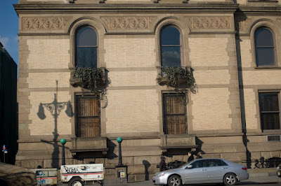
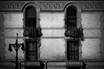
Saturday, February 10, 2007

The Classic Photography of Michael Kahn

Today I came across the website of renowned photographer Michael Kahn. His collection of seascapes and sailboats resonate with both my love of photography as well as my affinity for themes of voyage and the ocean.

According to his website:
With his 1950's designed camera, Michael travels extensively to photograph the world's finest boats and pristine seascapes. He collects his images on traditional black and white film; then, he produces his luminous silver gelatin photographs in his darkroom using skills that he has refined over the years. Michael Kahn’s traditional technique united with his distinctive sense of form, composition, vision and technical mastery has helped him to become one of the most collected photographers of our time.
Simply amazing! Have a look.

Friday, February 09, 2007

P&P Workflow: #4

by Jason D. Moore
Before:
Taken on 72nd Street, NYC 1/30/2007, 11:15 AM
Taken with available light, no flash.
  • Nikon D50
    Auto Exposure Mode
    18.0-50.00 f/3.5-5.6 lens
    1/250 at f/4.0
    ISO 200
    Focal Length 24mm
    RAW

In LightroomDevelop Module:

  • Cropped so the two lights were in line with the diagonal and just outside of the intersections of the thirds and rotated 2.20 degrees.
  • Basic:
    White Balance: As Shot
    Temp: 4800
    Tint: -14
    Exposure: +0.54
    Recovery: 100
    Fill Light: 26
    Blacks: 15
    Brightness: +50
    Contrast: +25
  • Tone Curve:
    Sliders below the curve at: 10, 60, and 77
    Highlights: 0
    Lights: +22
    Darks: -68
    Shadows: 0
  • Color Adjustments:
    Saturation:
    Reds: +54
    Yellows: +13
    Greens: +100
    Cyans: +54
    Blues: +47
    Magentas: -40
  • Split Toning - Highlights:
    Hue: 36
    Saturation: 45
  • Detail:
    Sharpen: 100
    Smooth: 0
    De-Noise: 25
After:
*If you would like to contribute to the P&P Workflow, please email Jason.

Thursday, February 08, 2007

"The streets are alive"

A while back I came across this blog that really caught my attention. It's by no rules, street non-photographer Nitsa. There's no real way to adequately describe her work other than to say it is original, unconventional, and there's just something about it that makes me want to grab my camera and head out. Check it out!

Wednesday, February 07, 2007

Apparently...

If you do a search for "nude cloggers" on Google, this blog is #1!

(Thanks to my post about Scott Kelby's post about my post about Dave Cross.)

P&P Workflow: #3

by Jason D. Moore

Before: 
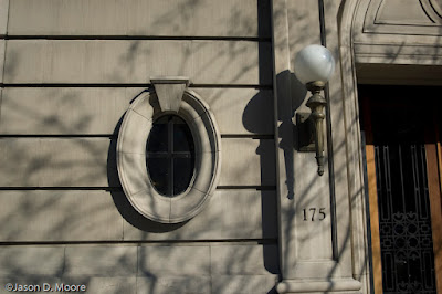
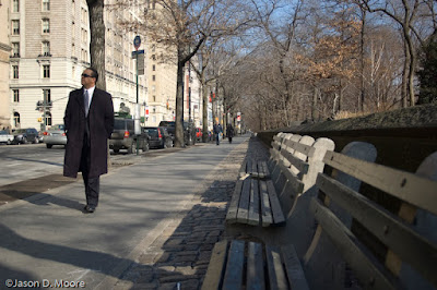
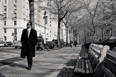
Taken in Grand Central Station, NYC 1/30/2007, 1:40 PM
Taken with available light, no flash.
  • Nikon D50
    Auto Exposure Mode
    18.0-50.00 f/3.5-5.6 lens
    1/20 at f/3.5
    ISO 800
    Focal Length 18mm
    RAW

In LightroomDevelop Module:

  • Cropped and rotated so the line of lights at the far end of the room were level and along a third and the left edge of the large flag was along a third.
  • Basic:
    Recovery: 32
    Blacks: 16
  • Tone Curve:
    Highlights: 0
    Lights: +19
    Darks: -27
    Shadows: 0
  • Color Adjustments:
    Hue:
    -Yellows: -7
    Saturation:
    -Reds: +100
    -Yellows: -40
    -Greens: 0
    -Cyans: +54
    -Blues: +13
    -Magentas: 0
  • Detail:
    Sharpen, Smooth, De-noise = 100
  • Lens Corrections:
    Vignetting Amount = -69

In Photoshop CS3 beta:

  • Lab Sharpening
    -Duplicate background layer
    -Convert to Lab Color mode (Don’t flatten)
    -Select the “Lightness” channel
    -Apply an Unsharp Mask filter with the settings: Amount: 81%, Radius: 1.0px, Threshold: 0 levels
    -Convert back to RGB (Don’t flatten)
  • Lower the opacity of this layer to 75% (to your taste) to help the sharpening blend more smoothly.
After:
*If you would like to contribute to the P&P Workflow, please email Jason.

Tuesday, February 06, 2007

Nikon D200

For almost a year now I've been running around with a Nikon D50 and have really enjoyed my results. However, I knew when I got it that I was getting the best camera for my price range and I would upgrade when I had the money. Well, the company I work for is selling our old Sony Cyber Shot DSC-F717 and will be buying my D50, with the proceeds (plus whatever my tax refund will be) going towards my purchase of a new D200 with an MB-D200 multi-function vertical grip and remote shutter release. 
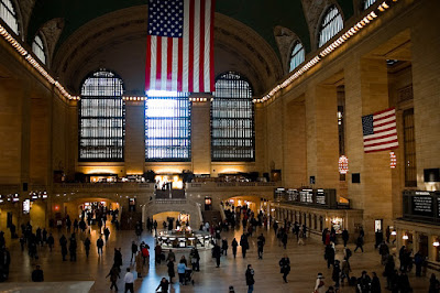
I'll still have use of the D50 as my backup body and for any work-related photography that won't require the use of the D200 - like taking pictures of eBay auction items.

My next big photo purchase will definitely be a good carbon fiber tripod and ball head as well as a Really Right Stuff L-bracket. In time...

Monday, February 05, 2007

P&P Weekly: #20


The Photoshop & Photography Workflow project is off to a great start. I have a few shots from my trip to NYC last week that I will be writing up and posting over the next couple of weeks. If you'd like to participate, please do. Click here for more details.

This week is going to be a little unusual given my work schedule. We're providing sound for a local high school's production of Oliver! and the rehearsals will be taking up a great deal of time. I'll still try to post something every day, as has been my hope.

Also, as always, please let me know if you would like to be profiled in the P&P Blogger Profile series.

In the meantime, here’s what’s been happening this week in The Photoshop & Photography Blogroll:

Want to be added to The Photoshop & Photography Blogroll? Click here to find out how! Update your blogs often! I will only include links to posts added since the last P&P Weekly.

As always, if you have any suggestions or notice a discrepancy, please email me.

Sunday, February 04, 2007

AFI's 100 Years 100 Movies

As a birthday present last year, my parents gave me a membership to the American Film Institute (AFI), being the movie nerd that I am. One of the benefits of being a member includes voting rights for their 100 Years series that has become popular over the past decade. Last year was the 100 Cheers, ranking the 100 most inspirational films of all time. This time around, they are revisiting their top 100 Movies list to include films released in the last 1o years and will continue to do so every decade of the 21st Century as a way to track the changing cultural perspective and influence of American cinema.

Out of 400 preselected films, I was able to select my 100 favorite (I can write in up to 5 out of that 100) and rank my top 5 to be included in the balloting for the telecast to be aired sometime in June. I'm not going to list all 100 here but I wrote in American History X, Finding Neverland, Fame, Finding Forrester, and Mr. Holland's Opus. And I ranked my favorites (which I hate doing because it shifts around and I love so many) as The Godfather, The Bridge on the River Kwai, Ordinary People, On Golden Pond, and Rain Man.

What are your favorites?

Saturday, February 03, 2007

Lightroom-News.com

On the heels of Adobe's announcement of Photoshop Lightroom 1.0, the folks over at PhotoshopNews.com have just launched LightroomNews.

One of the things I noticed while looking around was a feature article called "A Visit to Adobe" - which some may recall from July post from PSN. It's a great piece that takes you into the heart of where Photoshop is born - but only to the door of the "holy of holies."

I always enjoy getting a glimpse into the environments where the movers and shakers of the creative fields work. One of my favorite special features on a DVD is where Pixar takes you through their facility and shows you all of the personality, the creature comforts, and madness that allows their staff to be free to create. And it seems as though Adobe is on a similar track.

On a somewhat related note, I was listening to NPR last week and they had a short piece on the changing trends in office decor. Where there used to be a lot of grays, sterility, cold lighting and utilitarian furniture, there is now warmth, comfortable fabrics, soft couches, and open spaces instead of the formerly requisite cubicles.

I think it's a great idea !

(Wow, that's not where this post was initially headed...)

Friday, February 02, 2007

P&P Workflow: #2

by Andy Smith - "Film Noir"

Before:

Olympus Evolt 500
Handheld
Raw
1/19/07
8:00 PM
f/3.5
18 mm focal length
ISO 100
.4 seconds
Movie theater, Hanover, PA
----------
I originally worked with a similar shot in color, which ended up being ok, but the "film noir" concept crossed my mind.

  • I opened the file in Adobe Camera Raw and used the "Fluorescent" preset to minimize the color cast. Opened the file in Photoshop.
  • Rotated the image and cropped it to provide better attention to the line of posters.
  • Next three steps are from a Scott Kelby book:
    - Converted the image to LAB mode, then selected the Lightness Channel.
    - Converted the image to grayscale, then RGB mode.
    - Duplicated the background layer, then set the mode of this new layer to "Multiply."
  • Used the Shadow/Highlight adjustment to create the desired balance between light and dark tones.
  • The next three sharpening steps are also from Kelby:
    - Copied the image into a new channel, and selected the edges.
    - Used "Levels" to make sure only the edges were selected. The selection was then inverted.
    - Used the Unsharp Mask to sharpen the edges, then deselected.
After:
*If you would like to contribute to the P&P Workflow, please email Jason.

Thursday, February 01, 2007

P&P Workflow: #1


Before:
Taken in Malta, NY 7/3/06, 4:09 PM in full shade.
  • Nikon D50
    Auto Exposure Mode
    18.0-50.00 f/3.5-5.6 lens
    1/125 at f/5.6
    ISO 400
    On-Camera Flash did fire
    Focal Length 50mm
    JPEG – I was letting my nephew use the camera and didn’t feel the need to shoot in RAW.

In LightroomDevelop Module:

  • Cropped so the subject would be centered on the right-hand third line and the eye brows would be just about even with the top third line.
  • Basic:
    Convert to Grayscale
    Blacks: 15
    Brightness: +18
    Contrast: +45
  • Tone Curve:
    Moving the sliders below the curve to 43, 65, and 81 to direct where the adjustments will be focused.
    Highlights: +8
    Lights: +11
    Darks: 0
    Shadows: -35
  • Grayscale Mixer:
    I made the blues and cyans that appear in his shirt darker in order to draw the eye into the lighter tone in his face. Likewise, the greens help to darken the background ever so slightly.
    Reds: +150
    Yellows: +106
    Greens: -50
    Cyans: -50
    Blues: -6
    Magentas: -50
  • Split Toning:
    Highlights & Shadows: Hue 22, Sat 25
  • Detail:
    Sharpen and Smooth = 100
    De-noise: 0

In Photoshop CS3 beta:

  • Convert the image for SmartFilters
  • In Quick Mask, using a black to white radial gradient, I made a selection from the center of the face to the left edge.
  • Exit Quick Mask and add a Lens Blur with the following settings:
    Shape: Hexagon
    Radius: 26
    Blade Curvature: 4
    Rotation: 49
    Brightness: 0
    Threshold: 255
    Noise: 2 (Uniform, Monochromatic)
  • In the mask, paint with black over the subject, especially the edges to make him stand out from the background even more.
  • I applied a Vignette with the Lens Correction Filter with an Amount of -40 and a Midpoint of +30 to hold the viewer in the frame.
  • Applied a Curves Adjustment Layer with a Blend Mode of Luminosity, to the eyes with an Input of 25 and Output of 50. When I made the initial adjustments in Lightroom the tone of the eyes were pushed towards black, this just brings them back a little.
After:
*If you would like to contribute to the P&P Workflow, please email Jason.